I'm a professional and freelance web developer, currently working for the City of Topeka as the senior web developer.
I specialize in simple, beautiful websites that are always mobile-friendly.
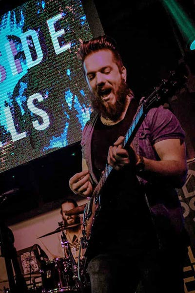
I'm also a musician, and play in the band Oceanside Hotels.
I am proficient in:
Languages:
Technologies:
Here are a few examples of some of the projects I've worked on recently.
This site is built on WordPress using a custom, one of a kind theme I built for it. The site features image galleries and large feature images available at the top of content pages (not all pages utilize this feature) to help customers see what they can expect at the shop, and what kind of work they do. As always, the site is fully optimized for mobile, including lazy loading images to help improve page load times.
This site was built using Wordpress. It's a custom child theme I designed using Bootstrap to handle the responsive design duties. It's fully mobile-friendly, and is set up with workflows to allow easy and consistent content management by staff. The site itself is hosted on AWS, which I also set up and manage. It's a custom, enterprise-grade solution, and can handle massive amounts of traffic.
Disclaimer: I am not the only one who contributes content to this site.
This is the website I made for my band, Oceanside Hotels. It's a simple site, utilizing HTML, CSS, JavaScript, and some of my favorite plugins.
This is a great example of a site of an affordable site. It's ideal for clients who just need a basic web presence and don't need to update content often. It saves a lot of time in the setup phase for me, which is why I can do these for less.
The Joint Economic Development Organization (JEDO) sports a clean, simple look that focuses on content delivery. It has lots of smooth transitions to help improve user experience give it a polished feel.
This site is hosted on AWS S3, which is a really solid, affordable solution for clients looking for cheap hosting. It also utilizes AWS ACM for SSL, and Cloudfront to improve loading times / availability.
The Tennant Chiropractic Clinic website is a great example of a website that utilizes colors to make its point, rather than pictures. Green was used to promote the soothing thought of healing, with alternating bands of white to add contrast. The site is simple, effective, and to the point.
Keeping the cost low is very important to me. Websites can be expensive, and I don't want that to be a barrier for you to get your business or project out on the internet.
My overhead for free lance work is low, so I can help keep your cost low. Email me to get a quote, or fill out my contact form.